Junkscape Poetry
Junkscape Poetry
Published in Eye 64 as ‘Set the Letters Free’
At an age that often signals retirement, Rosalie Gascoigne (1917-99) was beginning a career that would see her recognised as one of the most vital Australasian artists of the 20th century. An early interest in Ikebana had led to artistic awakening and an inspired body of work incorporating found materials. At 64 she was the first woman to represent Australia at the Venice Biennale. Approaching 70 she hit her stride, creating electric images of distilled experience, visual poems that meld culture and nature, language and landscape.
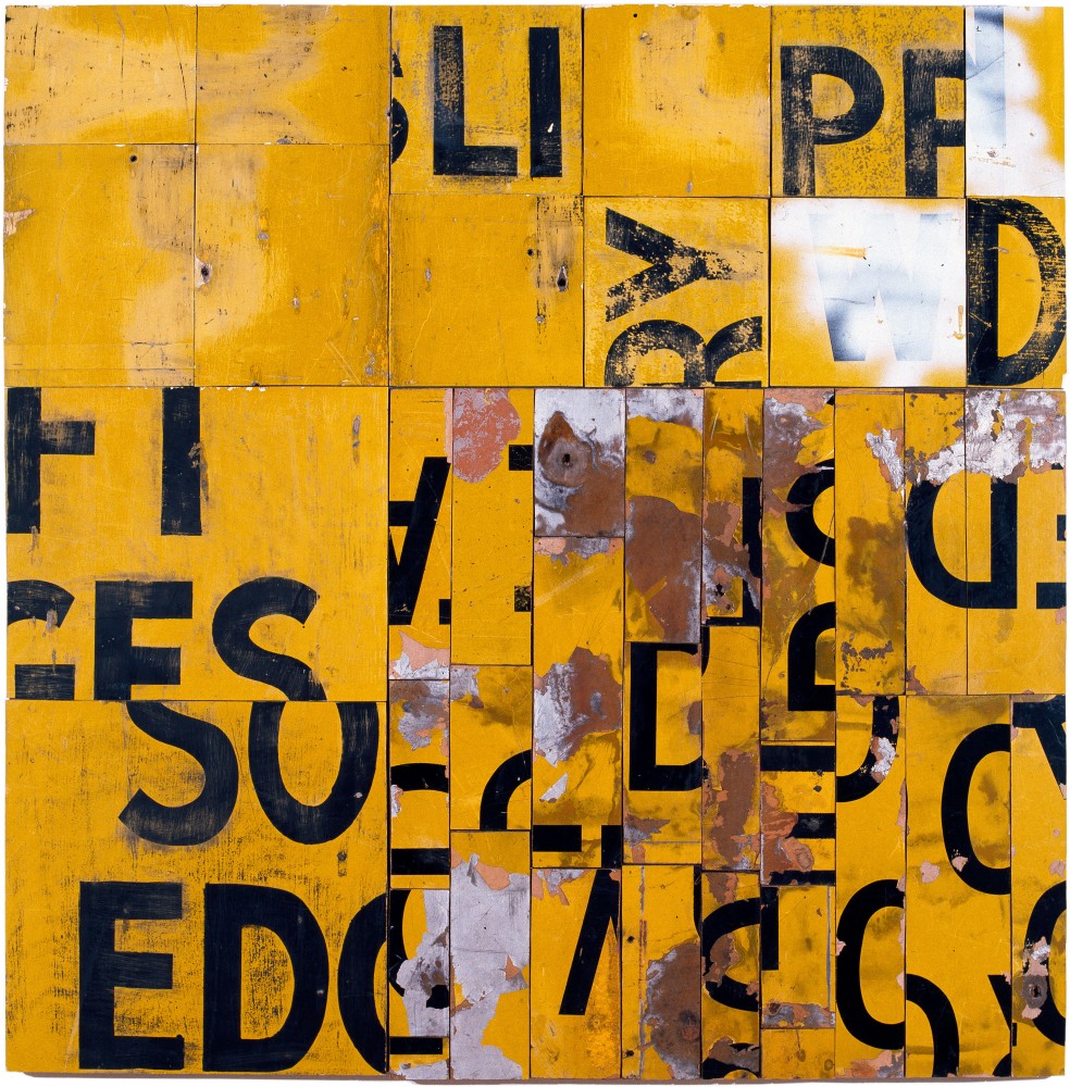
 Southerly Buster 1995, retro reflective road signs on plywood, 117 x 115cm.
Image courtesy of the artist and Roslyn Oxley9 Gallery.
Since colonisation Australian art has always had landscape as its backbone and Gascoigne is part of that tradition. However, unlike much contemporary aboriginal art with its highly coded cultural and geographic symbols and spiritual custodianship, or that from the dominant European traditions, Gascoigne’s work is elusive, personal, intuitive and visceral.
When she moved to Mount Stromlo, outside the Australian capital, Canberra in 1943, Gascoigne began collecting domestic and natural detritus in long walks from her home. She had left her native New Zealand and was bored, lonely and isolated. She walked in the dusty heat collecting grasses and bones. In winter she watched the freezing wind punish the pine trees and empty the sky. Initially she used these objects for traditional flower arrangements and more adventurous Ikebana displays. In the mid sixties they became sculptural assemblages; in the seventies, installations; and from the eighties onwards, installations and iconic wall assemblages.
This is how the story goes in the art world, where Gascoigne’s works attract serious international collectors, and fetches hundreds of thousands of dollars.
But the story is incomplete. What is missing is any substantial discussion of that which makes Gascoigne’s art so singular: the expressive use of found letterforms. Why, when typography is the assertive visual feature in Gascoigne’s most emblematic work, is it never really paid much attention? It is like discussing Lichtenstein without mention of comics, or Picasso without African art. Is it because the artist herself did not much dwell on it in interviews or essays? Or because art writers consider it incidental, or beneath their critical realm?
Although there is not the space here to tell the whole story, perhaps at least a case can be made for redressing this neglect.
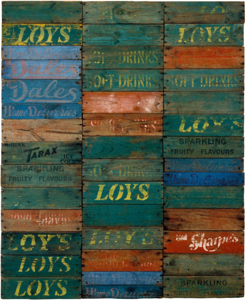
 Spring 1 1982, sawn wooden softdrink crates on plywood, 147 x 121cm.
Image courtesy of the artist and Roslyn Oxley9 Gallery.
So, to start again
In the beginning, building from the lessons of Ikebana, Gascoigne would sculpt figures from salvaged scrap metal and construct installations from gathered bones and other items. Her childhood interest in flower arranging had led, in 1962, to classes in the modern Sogetsu Ikebana school (her only art-related education) which in turn exposed her to the expressive possibilities of less conventional discarded objects. As she became more assured, there was an important shift from assemblages of feathers, product packaging, dolls and enamelware, to dimensional collages of corrugated iron, linoleum, soft-drink crates and road signs: from objects to materials. Through the manipulation of industrial text Gascoigne continued to evoke the characteristics of her local landscape while abandoning three-dimensional forms. In the relief surfaces of her mature work it is often printed text that provokes the tone, texture and movement of a specific landscape. Wind-rippled grassy plains. Cracked thirsty earth. Hazy distant scrubland.
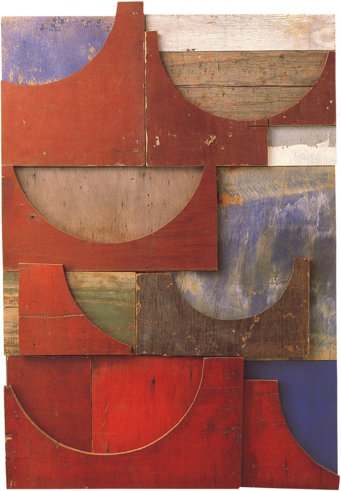
Gascoigne always limited her materials to the stuff she scavenged from this region. Faded wooden boards pried from soft-drink crates, scarred road signs and stenciled cable reels were her main typographic sources. Consequently her type use ranged from the controlled script of early logotypes, to the bold, open, instructional humanist sans serifs. Occasionally she used hand-brushed or sprayed roadside notices. Her son, Martin Gascoigne, suggests that the works made with builder’s form-board (Landfall, 1989; Hill Station, 1989), “especially the works which make use of pieces with either positive or negative curves”, also have a typographic nature. “You might see parallels with the shapes of printed letters and also the physicality of old lead type.”1
 Landfall, 1989, builders' formboard on plywood, 112 x 77cm.
Image courtesy of the artist and Roslyn Oxley9 Gallery.
Apart from cropping and composing, her physical intervention with these materials was negligible. She found items discarded in paddocks, building sites, by roadsides and most abundantly in community rubbish dumps. The salvaging process was inseparable from the process of assemblage: “Half your oeuvre is the going out and the seeing things,” she said in a television interview.2 She would collect anything that she thought was beautiful or interesting and sometimes keep it for months or years before using it, and sometimes not using it all.
When materials became scarce, her resourcefulness would usually prevail, as she recounts in a dairy entry written for an art journal, when, with a six-pack of beer, she successfully persuaded roadside workers to reveal the location of depots storing disused signage: “Chance is a fine thing and it serves me well, but this was organised opportunity.”3
The presence of letterforms varies greatly in the finished compositions, from whole words and phrases with the brand names and slogans of soft-drink cases in Spring 1, 1982, to clipped typographic details from road signs in works such as Monaro, 1989. There is an evolution towards greater abstraction in the later work – an embrace of the lyrical potency of pure graphic form. So when Gascoigne began experimenting with wooden soft-drink cases, she composed uncut panels with minimal cropping (Spring 1, 1982; Club Colours, 1983).4 The more she worked with this material the more complex the compositional grids and the more charged the typographic fragments became. This is type as image, and image as poetic possibility. The ordinary human compulsion to construct narrative meaning is frustrated, but is compensated with an intuitive experience of optical pleasure, and a physical and psychological evocation of place.
Beyond the Concrete
There is inevitably more going on here than Clement Greenburg’s claim for the Cubists’ use of type: “stopping the eye at the literal, physical surface of the canvas”. But it is another way in which Gascoigne asserts materiality. Typography’s usual task of visualising speech becomes secondary to its expressive material potential. The alphabet’s role as linguistic signage is not limited to describing, but through its intrinsic visual qualities, such as scale, rhythm, colour and texture, evokes direct expression of meaning.
 Monaro, 1989, synthetic polymer paint on sawn soft drink crates on plywood, 131 x 457cm.
Image courtesy of the artist and Roslyn Oxley9 Gallery.
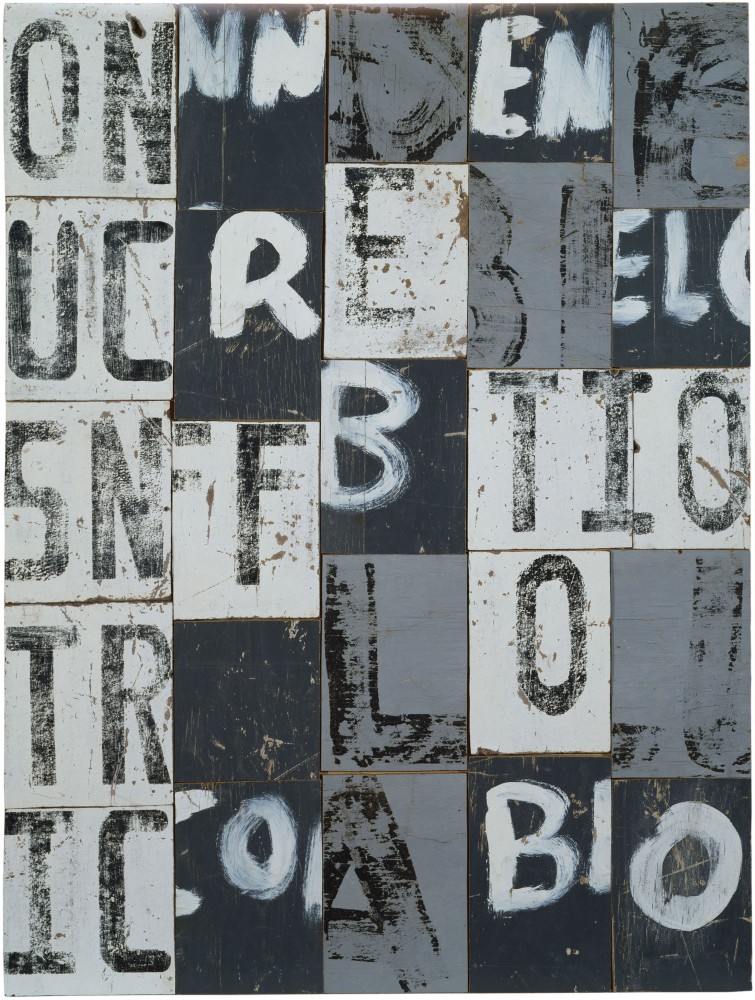
 Honeybunch, 1993, sawn timber rectangles on plywood, 109 x 82cm.
Image courtesy of the artist and Roslyn Oxley9 Gallery.
This period of experimentation and development for Gascoigne was the 1980s and 1990s – an era that produced related developments in the digital realm for adventurous graphic designers stirred by new technologies and the fallout of post-structuralist literary theory. The visual conclusions drawn by Gascoigne and many typographers and designers at the end of the twentieth century are an example of the shared formal concerns of contemporary art and design. Like the collagists before her, Gascoigne’s work paradoxically suggests many visual characteristics of digital media. Cut-and-paste computer technology, the employment and disruption of grids and the random dislocation of images borne from corrupted digital image files, are all strategies with parallels in her own work. They are reasons why her weathered, handmade assemblages feel so at home in the diffused hierarchy of interactivity where the linear conventions of written language are undermined by internet, email, hypertext and sms.
In the mid fifties, long before she discovered she was an artist, Gascoigne acquired a Braque print from an artist friend of her husband. The mass media appropriations of Braque and Picasso had kick-started the multimedia incorporation of found type into art. But where the Cubists integrated graphic signs into the prism of dismantled forms, Gascoigne often fractured the letters and words themselves. Gascoigne’s use of stenciled packing materials echoed Braque’s use of a commercial stencil to render fragments of words amongst disorientating picture planes, although in her case not to anchor meaning or space, but to free it. Here she is closer to Marinetti’s and the Futurists’ more radical manifesto Destruction of Syntax – Imagination without Strings – Words-in-Freedom: “The rush of steam-emotion will burst the sentence’s steampipe, the valves of punctuation, and the adjectival clamp. Fistfuls of essential words in no conventional order... With words-in-freedom we will have: Condensed metaphors. Telegraphic images. Maximum vibrations. Nodes of thought. Closed or open fans of movement. Compressed analogies. Colour Balances. Dimensions, weights, measures, and the speed of sensations.” Gascoigne has referred to her work as “stammering concrete poetry” and according to its original manifesto Concrete Poetry “refuses to absorb words as mere indifferent vehicles, without life, without personality, without history...”
These movements, along with other sympathetic strains of contemporary art and design focus on the instability of language. For Gascoigne the mutability of language was also an experience of the environment – a landscape that corrodes, decays and expires. In an excellent monograph (now out of print), Vici MacDonald identified other influences motivating Gascoigne’s play of visual language, including a love of poetry and crosswords, and her husband’s long-term speech impediment.
Rosalie Gascoigne died in Canberra in 1999 aged 82. By this time, many of her favourite materials were becoming increasingly difficult to find. The new printed plastics and alloys manufactured to endure the environment were alien to Gascoigne’s work. The drink crates, linoleum and masonite road signs that perish, revealing their history, are no longer commonly produced. But when she could harvest them from her landscape, their textures of material entropy and those of raw typographic form were amalgamated as abstract poetic possibility. This creative response to her countryside produced some of Australia’s most inventive typographic imagery, now celebrated as some of its most iconic contemporary art.
+
Jason Grant 2008
1. Correspondence with Martin Gascoigne March 18, 2007.
2. Australian Biography TV series. Transcript of interview, 2004.
3. Art Monthly Australia September 1989.
4. Vici MacDonald Rosalie Gascoigne Regaro, 1999.
Thanks to Roslyn Oxley9 Gallery and Martin Gascoigne for invaluable assistance.